MAPLIN
Responsive user interface design
Maplin website redesign
Maplin is a leading UK electronics store operating in the UK and Ireland. With over 200 stores Maplin offers a wide range of electrical products and tech services.
The challenge
Maplin wanted their online customer experience to keep inline with their new brand look and feel. In addition they wanted to improve the overall user experience on the site whilst making it easier for new and existing customers to find and purchase products and services.
Overall project goals:
• improve navigation experience
• Create a seamless in-store experience
• Bring new brand identity to life online
• Increase online product/service sales
• Improve overall customer experience

My role
My role was to focus on the UI/UX design, working alongside the lead UX designer to translate wireframes, and user flows into a visually pleasing interface design across desktop tablet and mobile. In addition I assisted with updating wireframes and assisted in usability testing.
I started my design process by analysing some of the relevant project material gathered during the early stages of the project. Such as the core user, their needs and issues with the existing website.
I also analysed some of the relevant UX material that had been created prior to me joining the team. Such as
• Personas
• Wireframes
• User flows
This provided me with greater understanding of the project goals and user needs.
Research
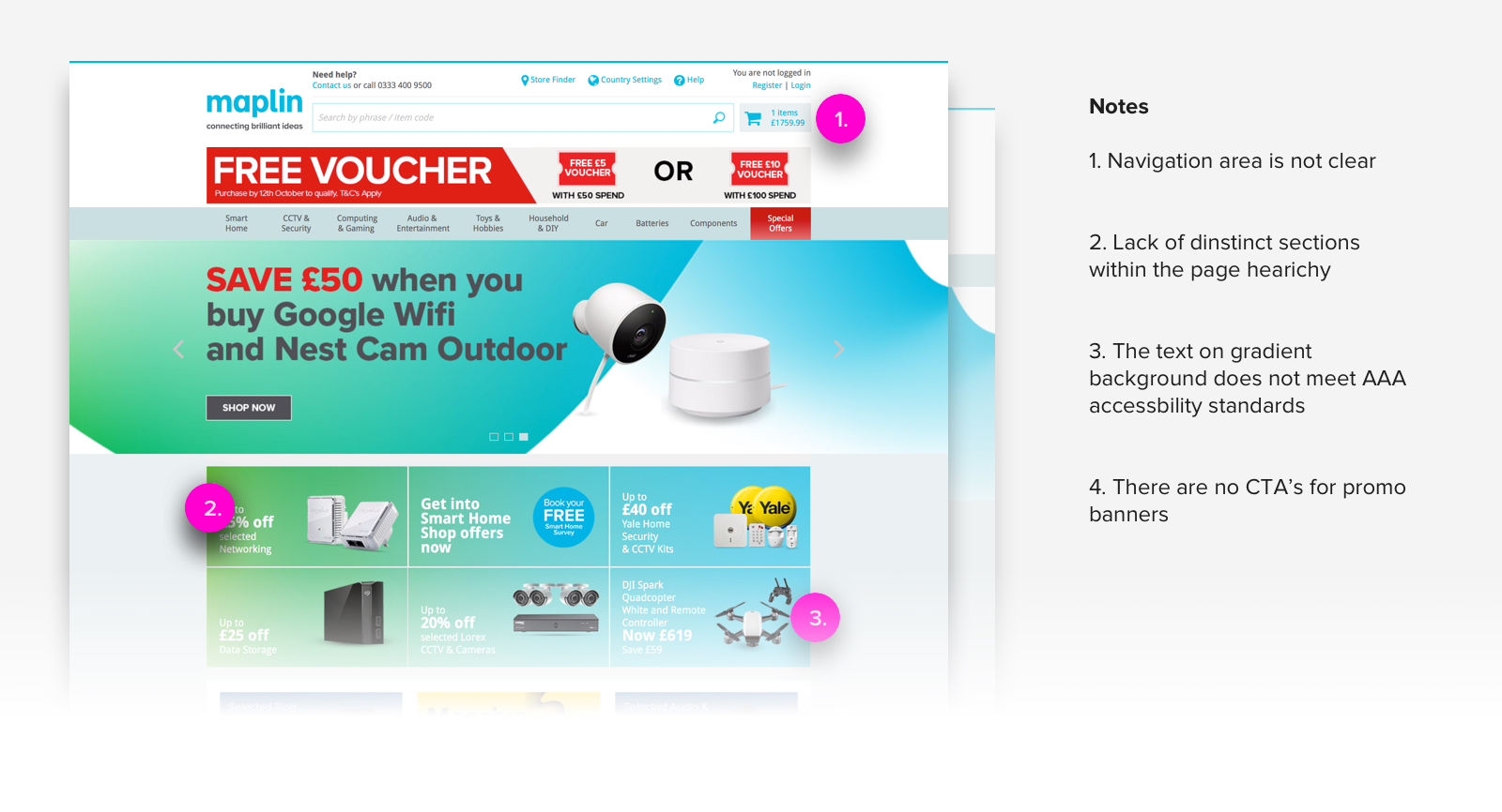
During the research process I discovered a few critical issues with the existing site. Some of these include:
• Homepage gets seem by 1 in 4 visitors on the website
• 51% of click throughs on the homepage were to promotions.
• 50% bounce rate on the product list page
• Only 3% users on product detail page proceeded to basket
The Redesign
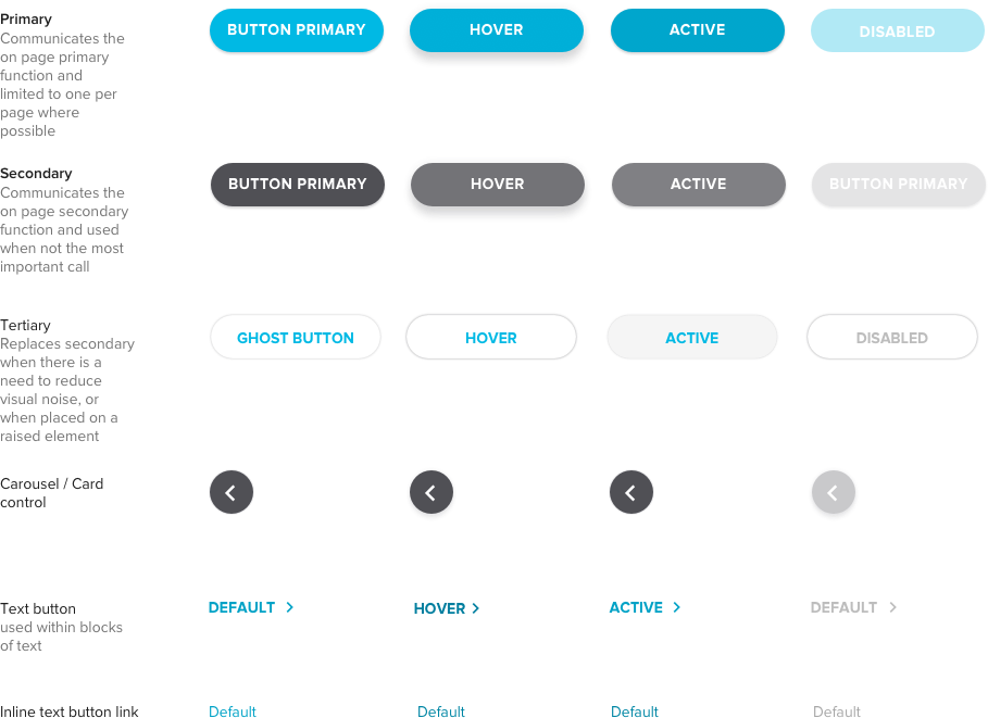
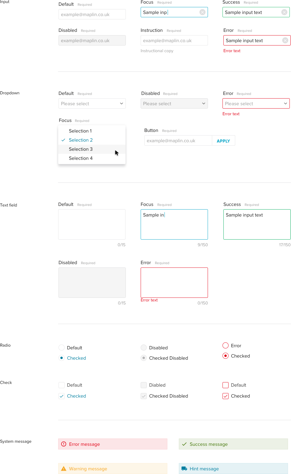
I started the redesign visual process by defining the granular elements of the UI. Such as -
• Colours
• Buttons
• Typography
• Iconography
• Form elements
I followed the atomic design principle to help guide me through this process as these elements would later form the components of the UI.
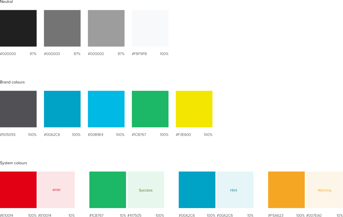
Colours
Typography

Buttons
Form elements
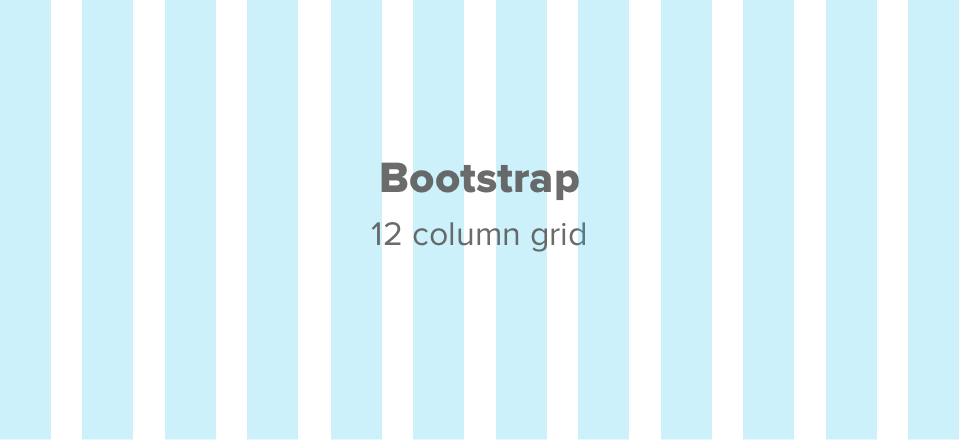
12 column Bootstrap grid system
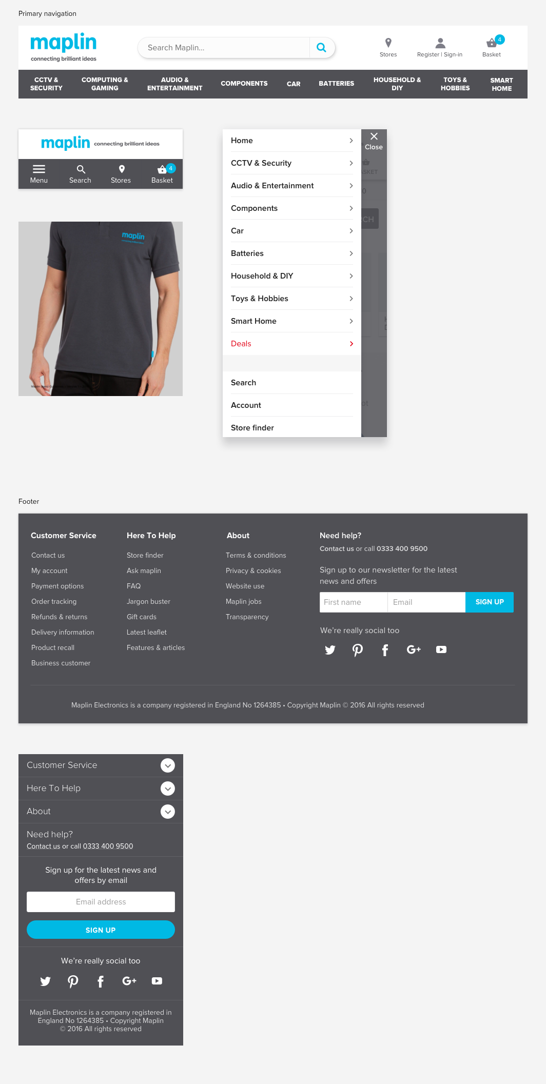
Header & Footer
Bold and confident header and footer is clear and easy to user whilst matching the in store uniforms to drive trust and expertise.
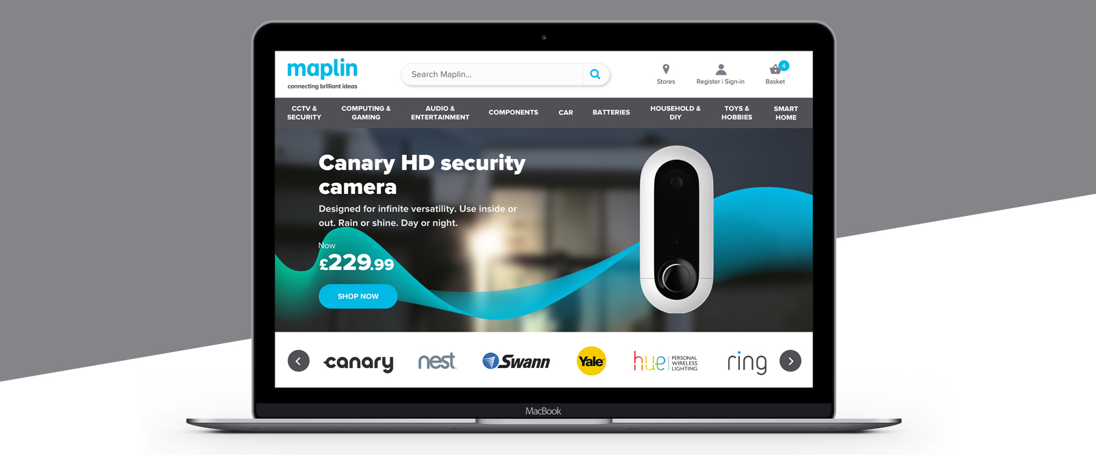
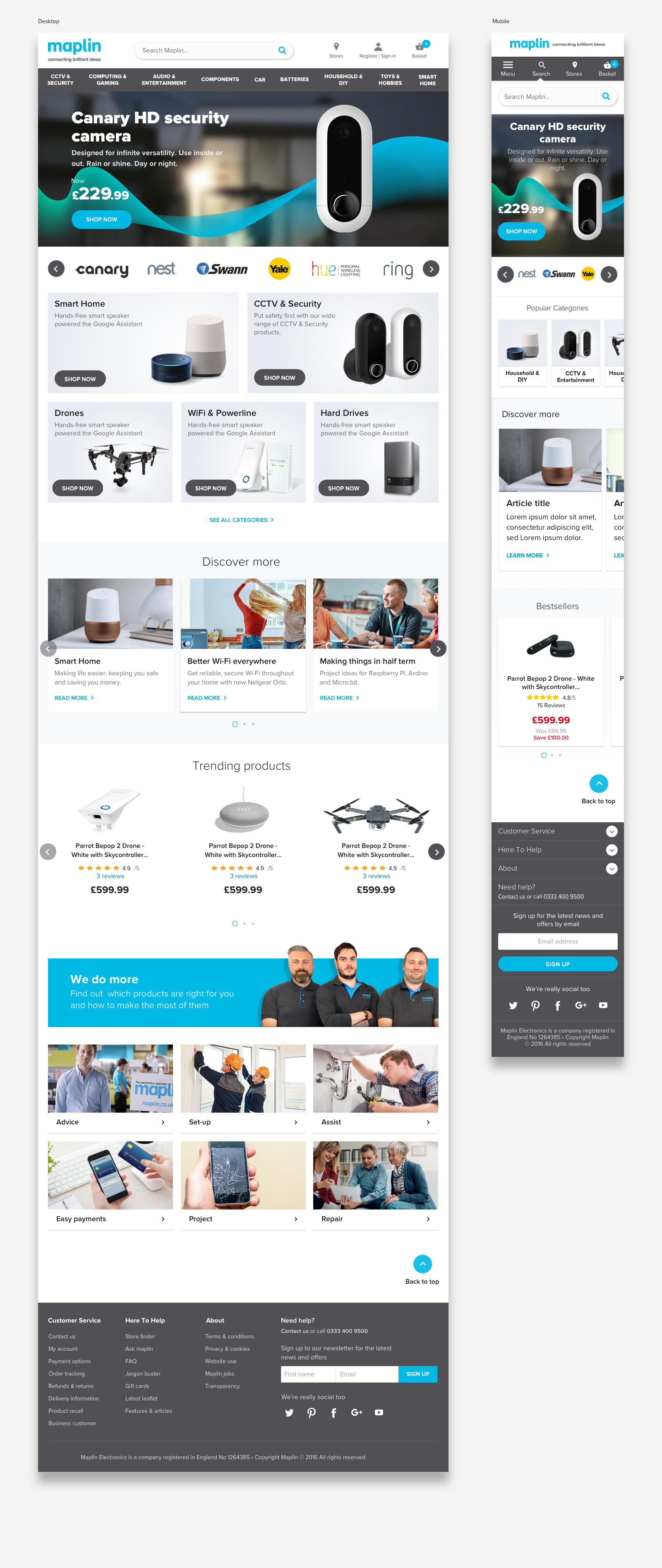
Homepage

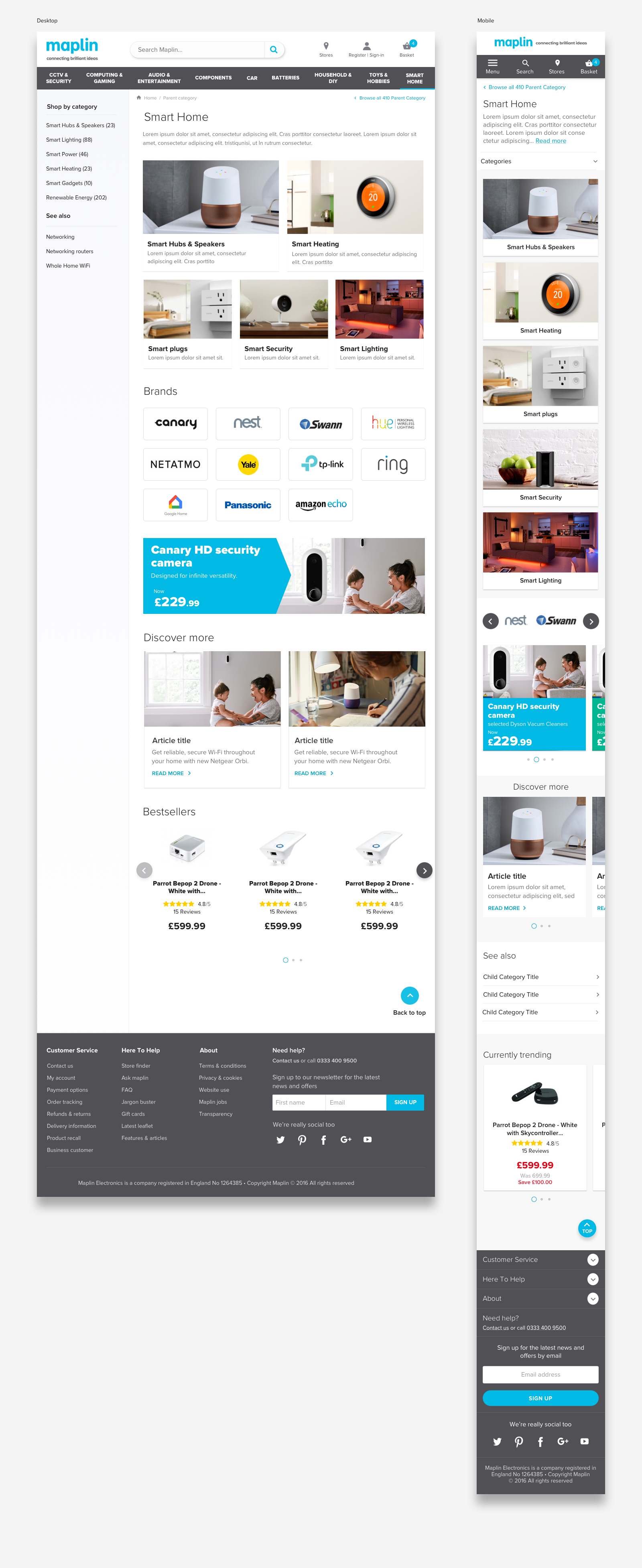
Category page
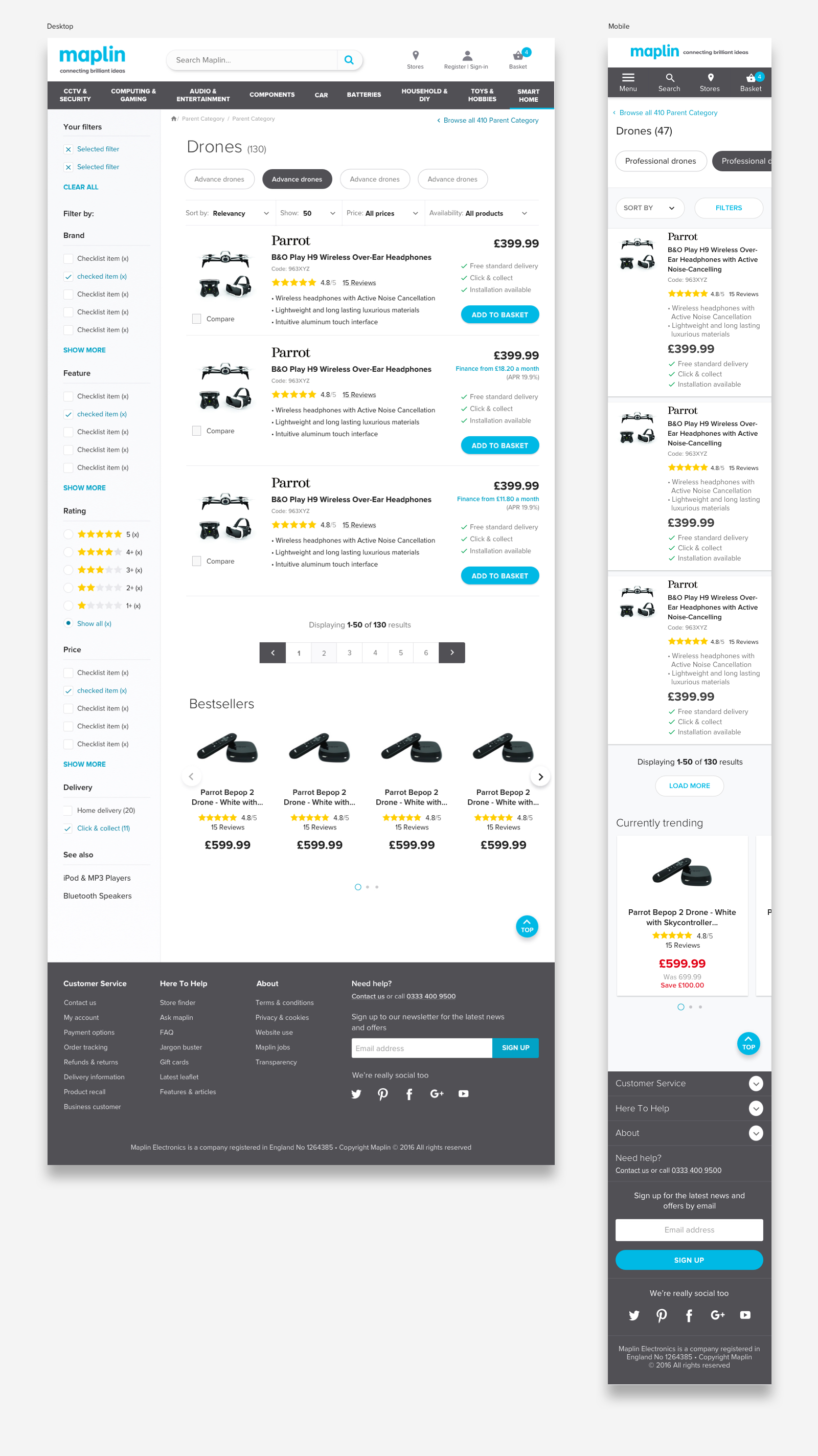
Product list page
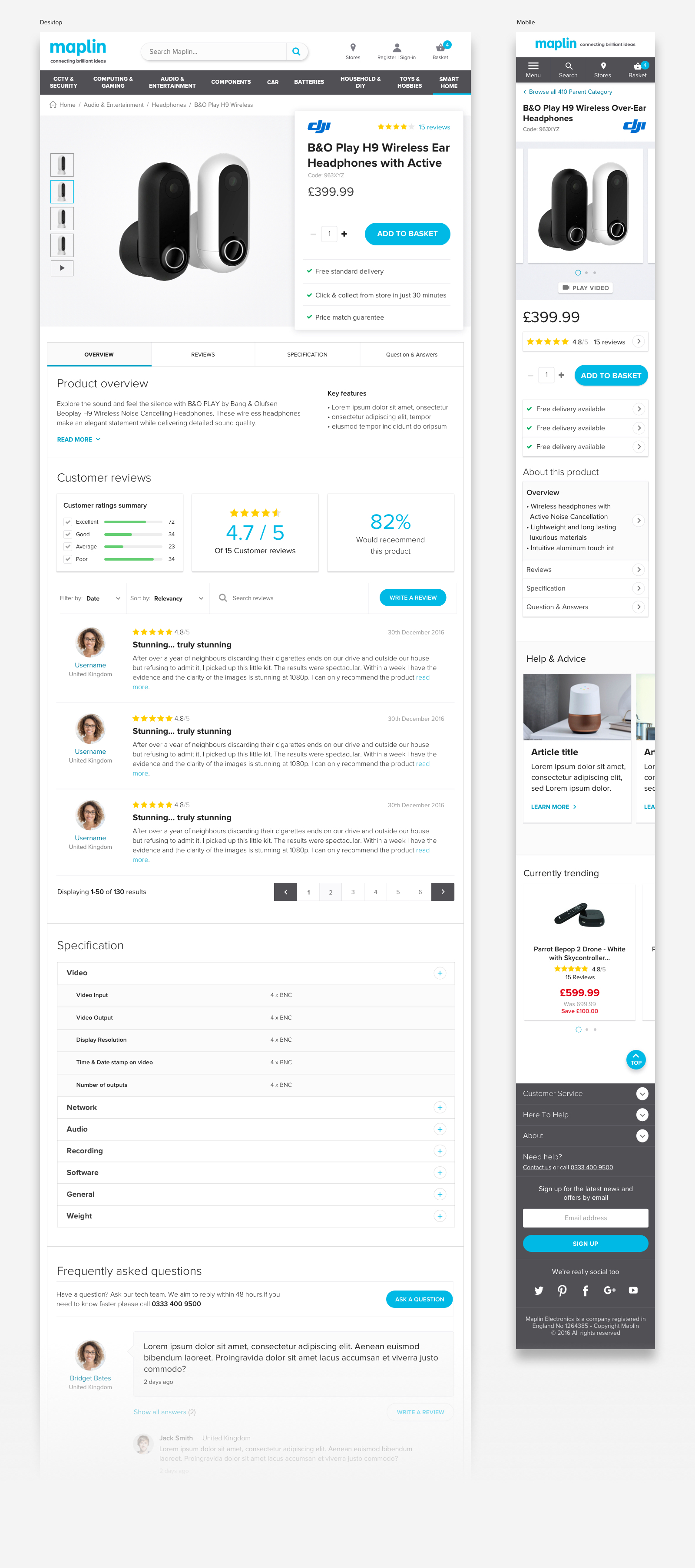
Product detail page