JIVJAV
Responsive website design
Brief & Project Context
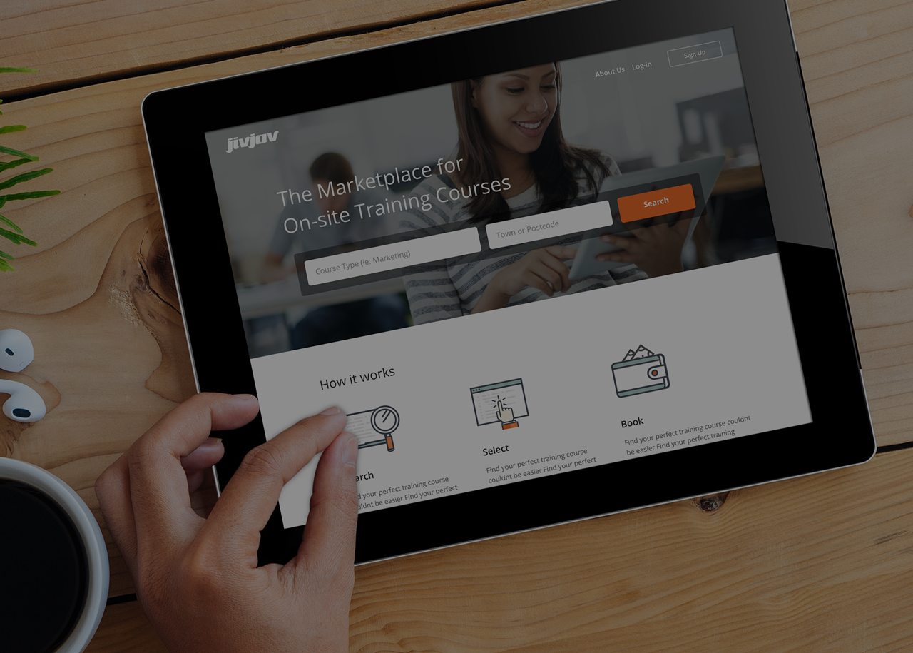
Jivjav is a start-up online marketplace that connects course providers with businesses and individuals. They offer courses in various industries, such as - HR, Marketing, Banking and Finance, Business and Engineering.
They approached us because they wanted to improve the overall user experience on the platform so that they could increase the number of course bookings.
Working within an Agile team, I was responsible for updating the key landing pages on the course bookers journey to booking a course. My role involved: User Research, Persona Creation, Wireframing, Prototyping and Interface Design.
Tools: Sketch, Illustrator,Photoshop, Invision, Excel, Survey Monkey,
This work was created during my employment at Energy House Digital. To comply with my confidentiality agreement I have omitted confidential information. These designs are a reinterpretation of the original.
The Problem
We identified a few key issues on the old site. The website traffic data suggested that there was a high bounce rate which we believed was partially due to the poor user experience on the platform.
Jivjav wanted to improve this by discovering what course bookers would expect from the platform, and updating the key pages accordingly.
User Research
At the start of the project there was a lot we needed to know about how course bookers were using the site to carry out key tasks and how they were using similar platforms to find and book courses.
As we were limited by time and cost constraints, the user research techniques we used included: User Surveys, Competitor Research and an analysis of how people were using the previous site.
From our research findings we were able to create two user personas. These ranged in age, gender and the stage of there career. We then selected a primary persona which reflected the most popular type of course bookers using the platform.
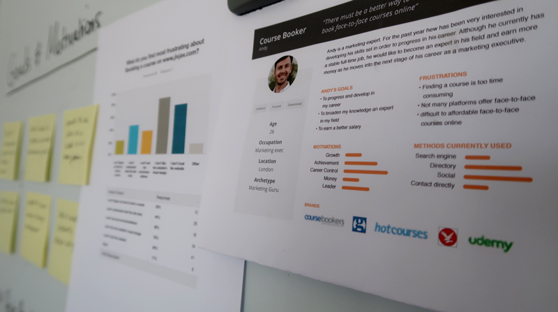
Design Process
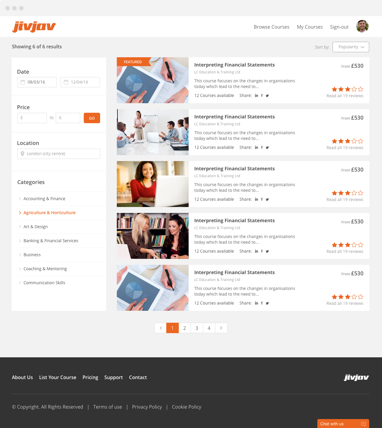
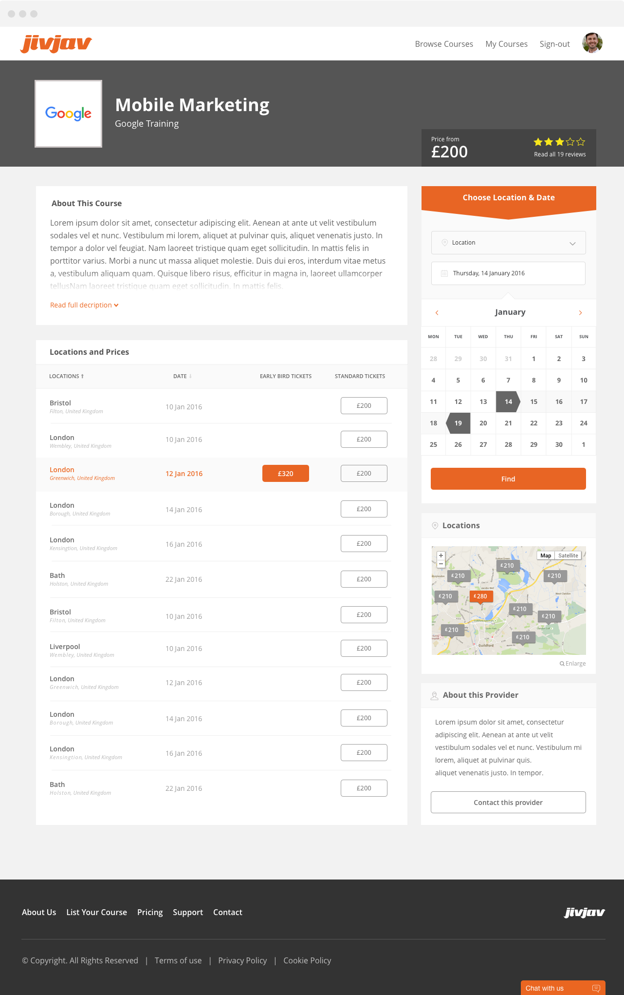
We kicked off the design process by defining the screens that our key persona user would visit on their journey to booking a course. These screens included - Homepage, Search results, Course detail page, Booking confirmation and Payment confirmation.
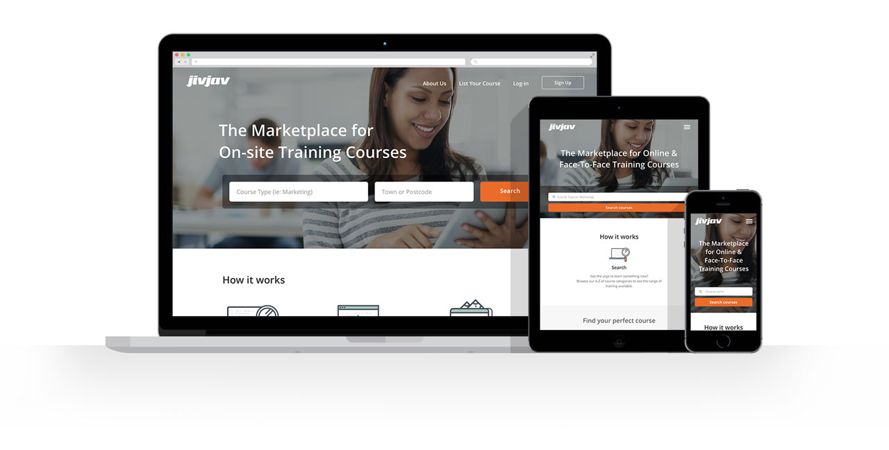
We then agreed that we would take a mobile first approach, as this would make designing the other screens much easier. I sketched out some ideas and presented to the team. Once we had combined our ideas into a consistent set of screens , I proceeded to create high fidelity wireframes for the Course booker's key landing pages.

Visual Design
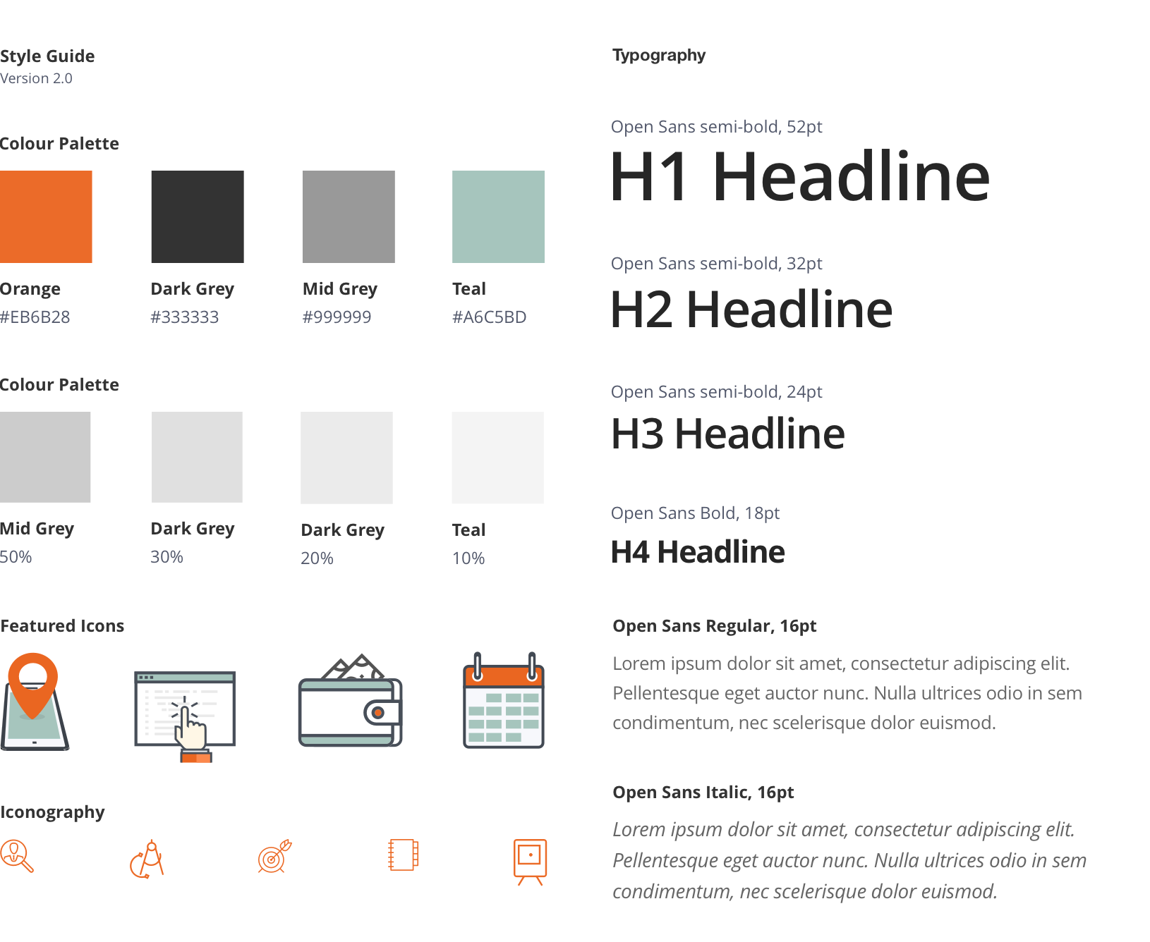
Using Jivjav's existing brand guidelines as a guide, I made the following improvements to the platforms visuals appearance:
- • Larger font sizes - 16pt for body text for improved readability.
- • Enhanced colour palette - Updating the secondary palette to give a friendly, professional feel.
- • New Icons - Making better use of visual communication by introducing a new set of primary icons to be displayed on key pages.


Conclusion
